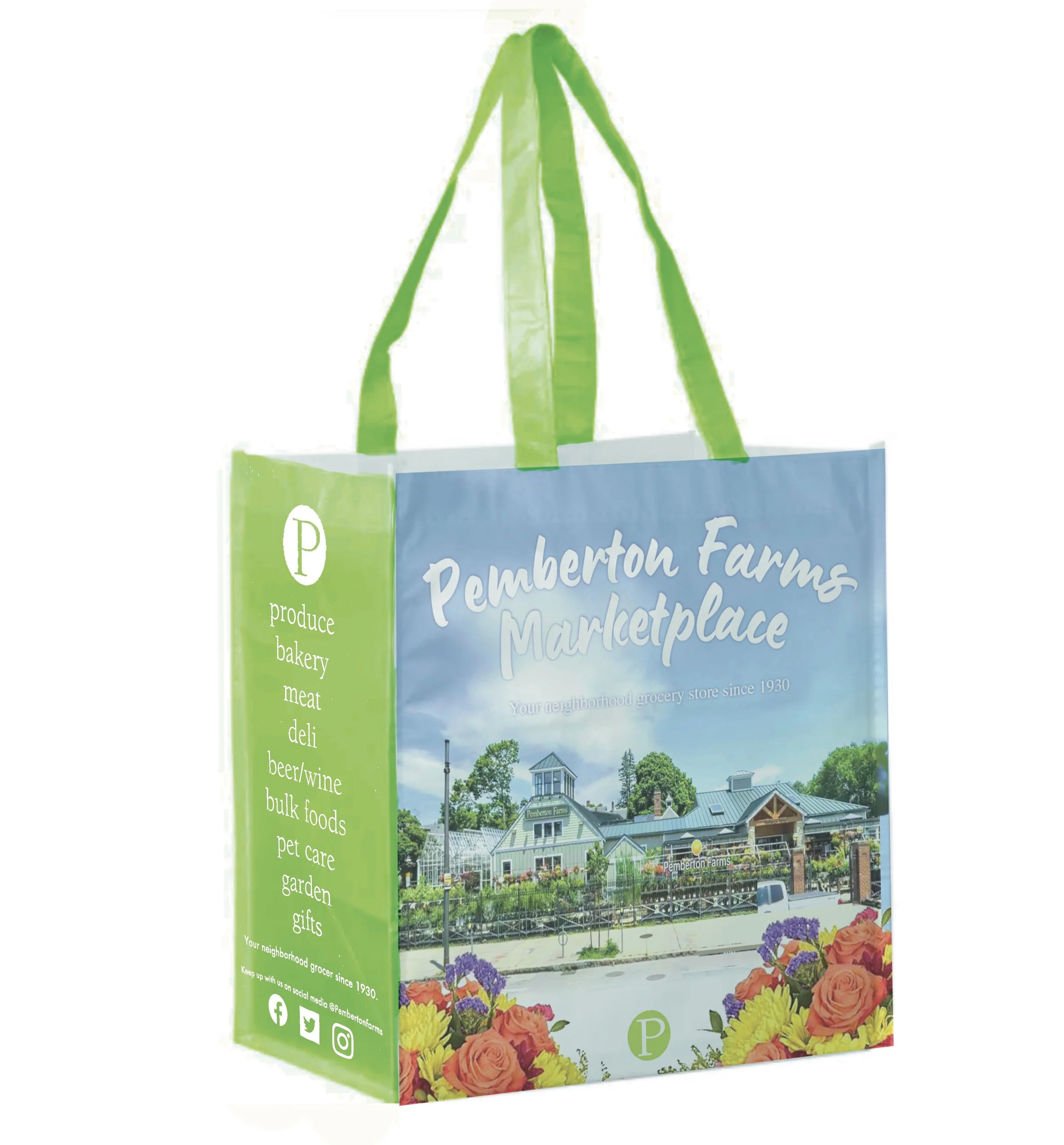
The Shopping Bag
The Idea
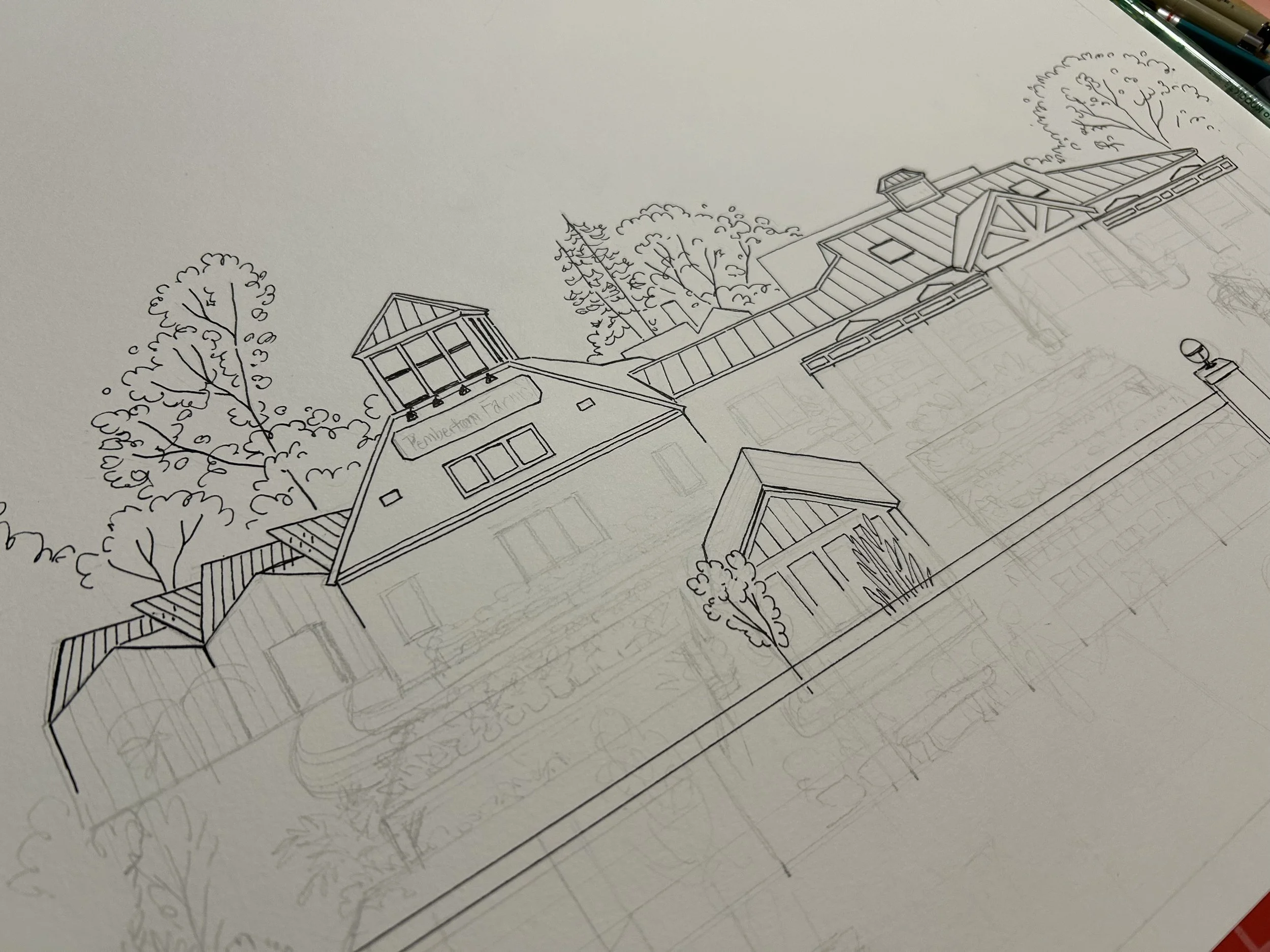
I strongly believe the best marketing tool for any grocery store is a good shopping bag. And when I was presented with this original architect’s sketch of the building, I knew what needed to be done.
The Design process
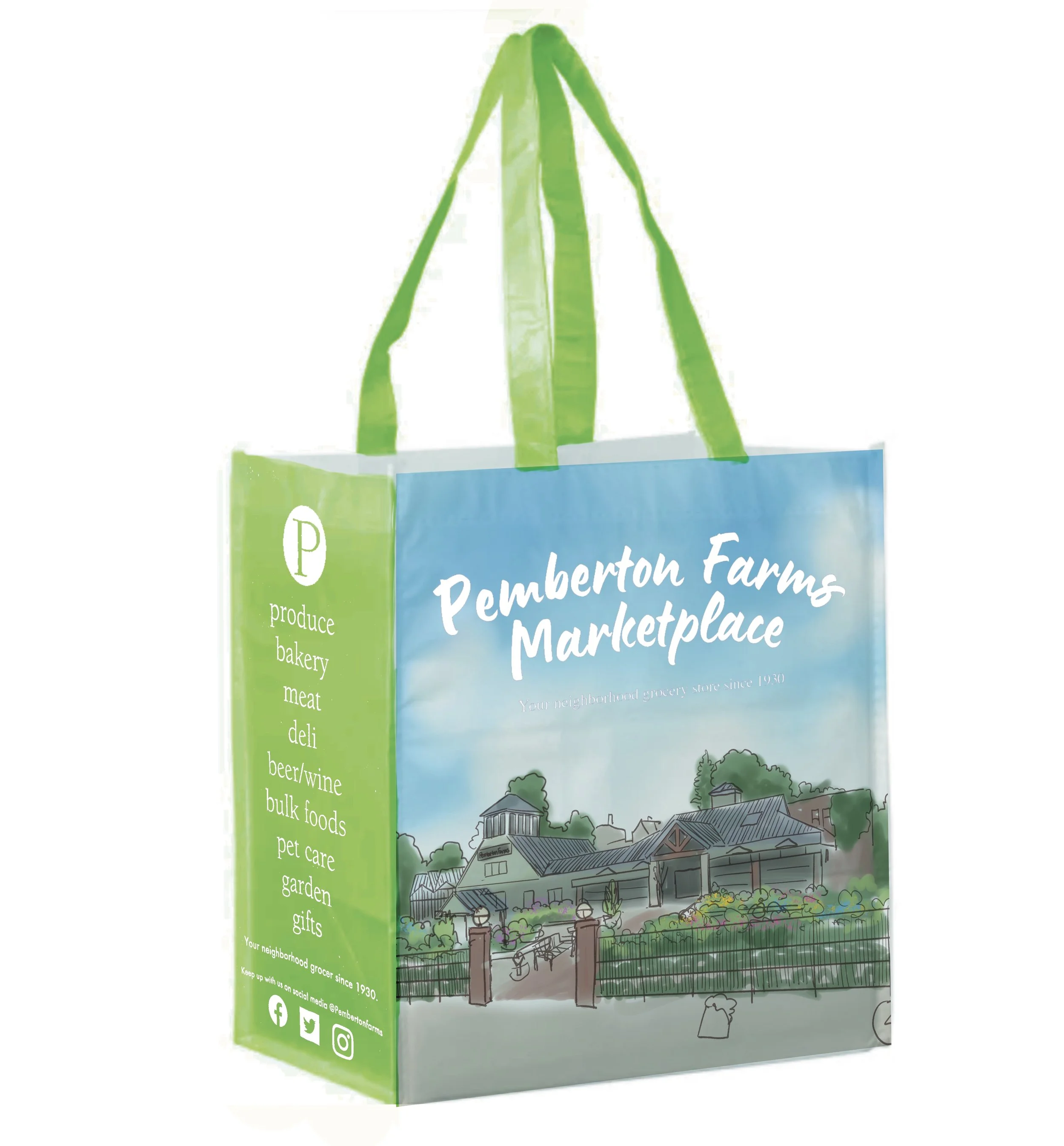

We knew from the start that we would be sticking with an ink and watercolor illustration, emulating but not directly copying the original architect’s sketch. The task then became how to best show off the building that all the shoppers know and love.

We decided the most flattering view would be a straight on wide shot that showed both the front of the building, the trees surrounding, and the lush garden center in front, and that the big blue sky would be used for the Company name and slogan.
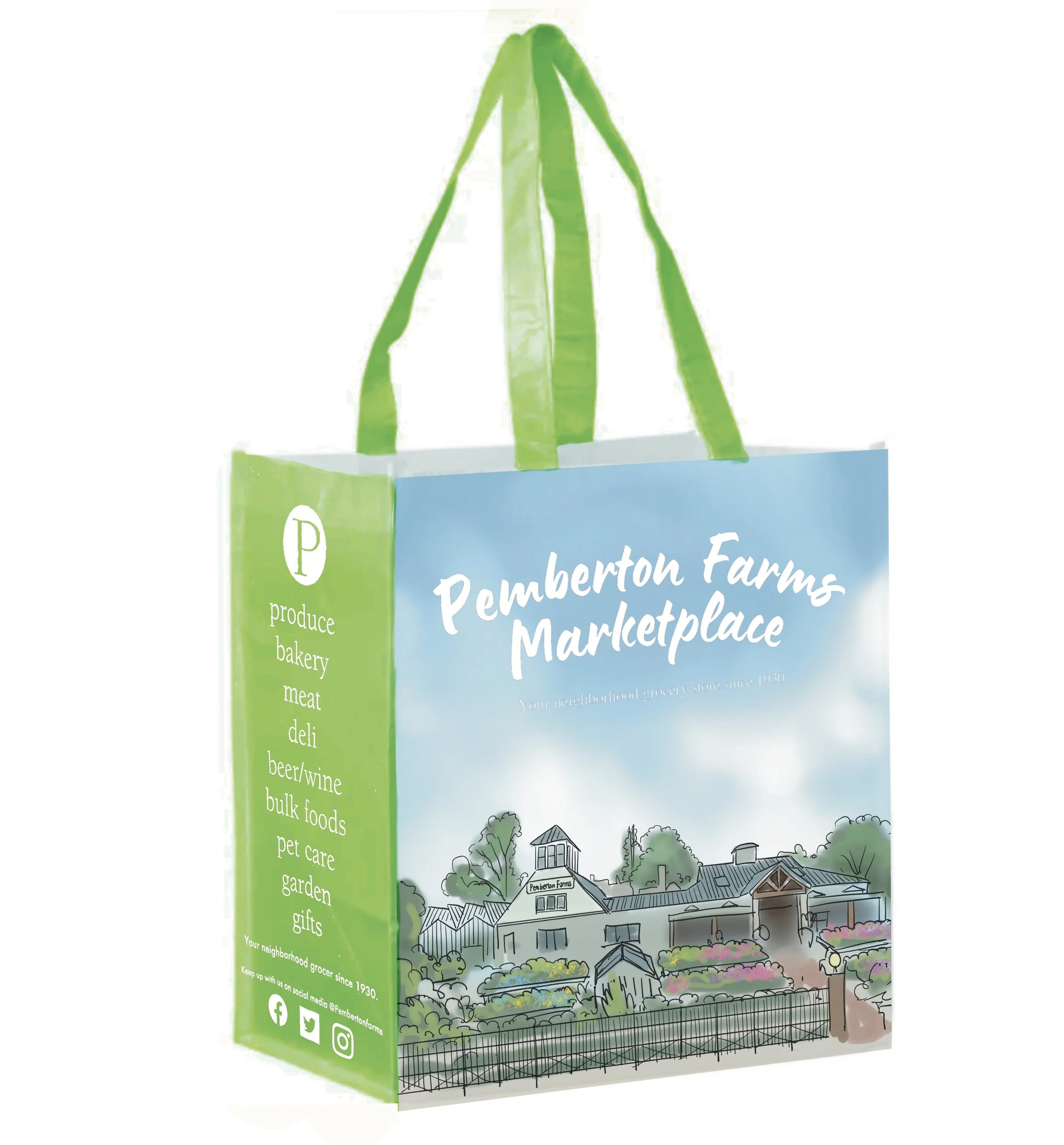
Change angle of building ––––––––––––Stronger focus on the garden center––––––––––––––––Just Right!
Final Product
The inspiration

First sketches
The Design process
As for the illustration style, our aim was to make the viewer think two things:
“Pemberton Farms” and “Yum!”
The challenge was to balance enough detail to entice people, but with enough simplicity that it would print and read well on a Tshirt.
So while the first draft was mouthwatering, it was a little too realistic and static for our purposes.
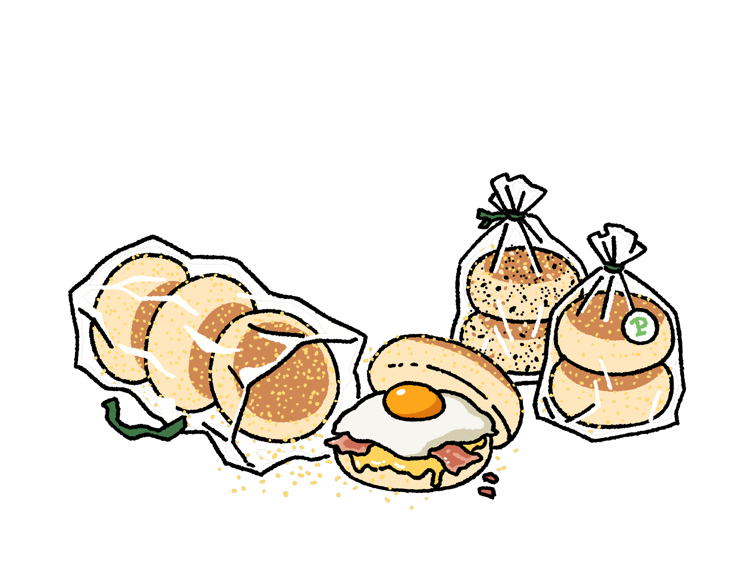
Ultimately I decided it would be best to go with a more graphic and cartoonish style to bring the muffins to life and give them some quirky character!
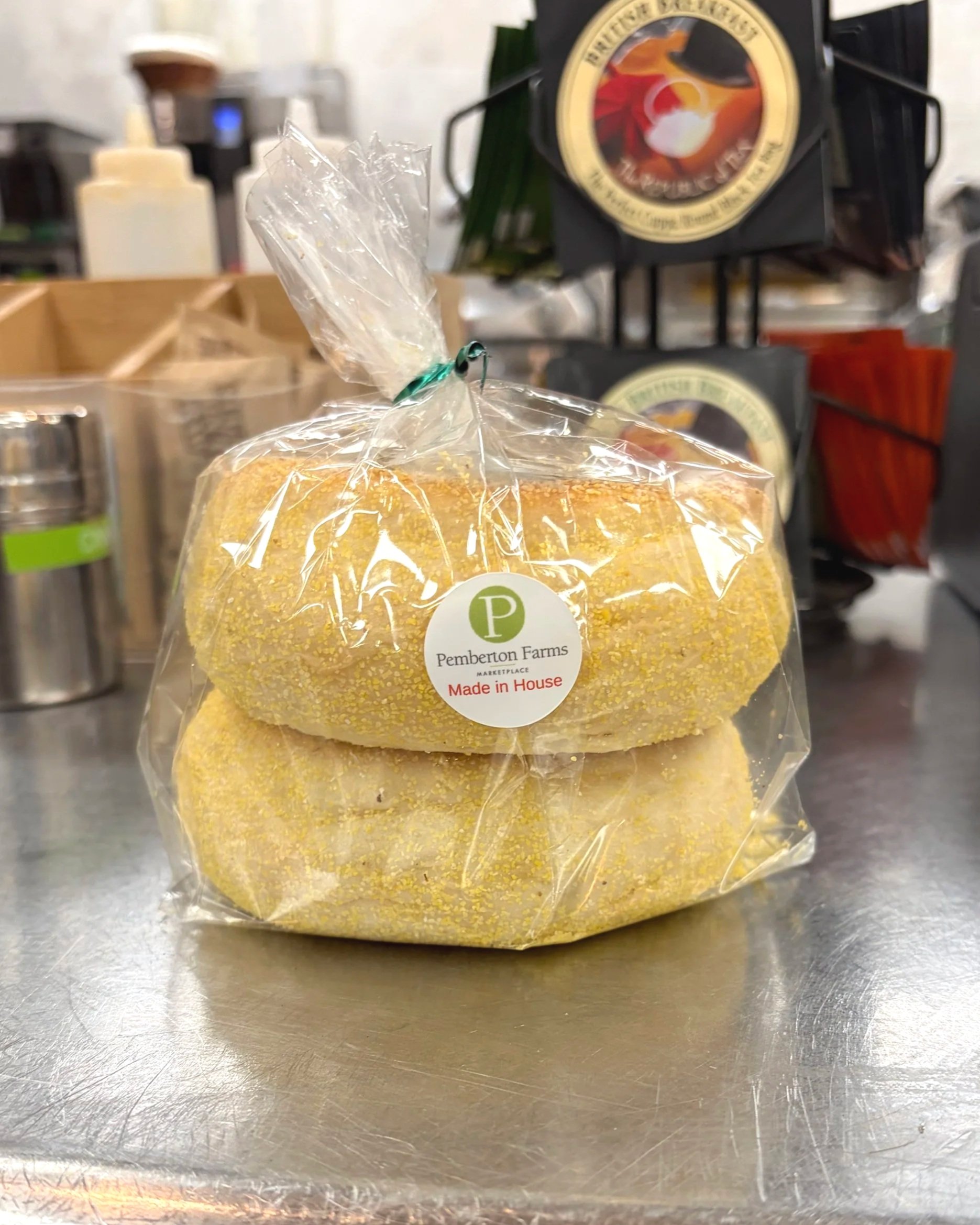
For the front of the shirt we settled on a two-pack of the muffins, just like how you’d see them on the shelf!

A slight departure of style for a new merch line.
The goal was to make a line of t-shirts that was fun and quirky, highlighting a select few Pemby’s original products, starting with the in house English Muffins. The front of the shirt would have a singular English Muffin, leaving out enough to draw in attention, then the back would showcase a delicious English Muffin buffet.
Pemby’s Faves T-shirt series

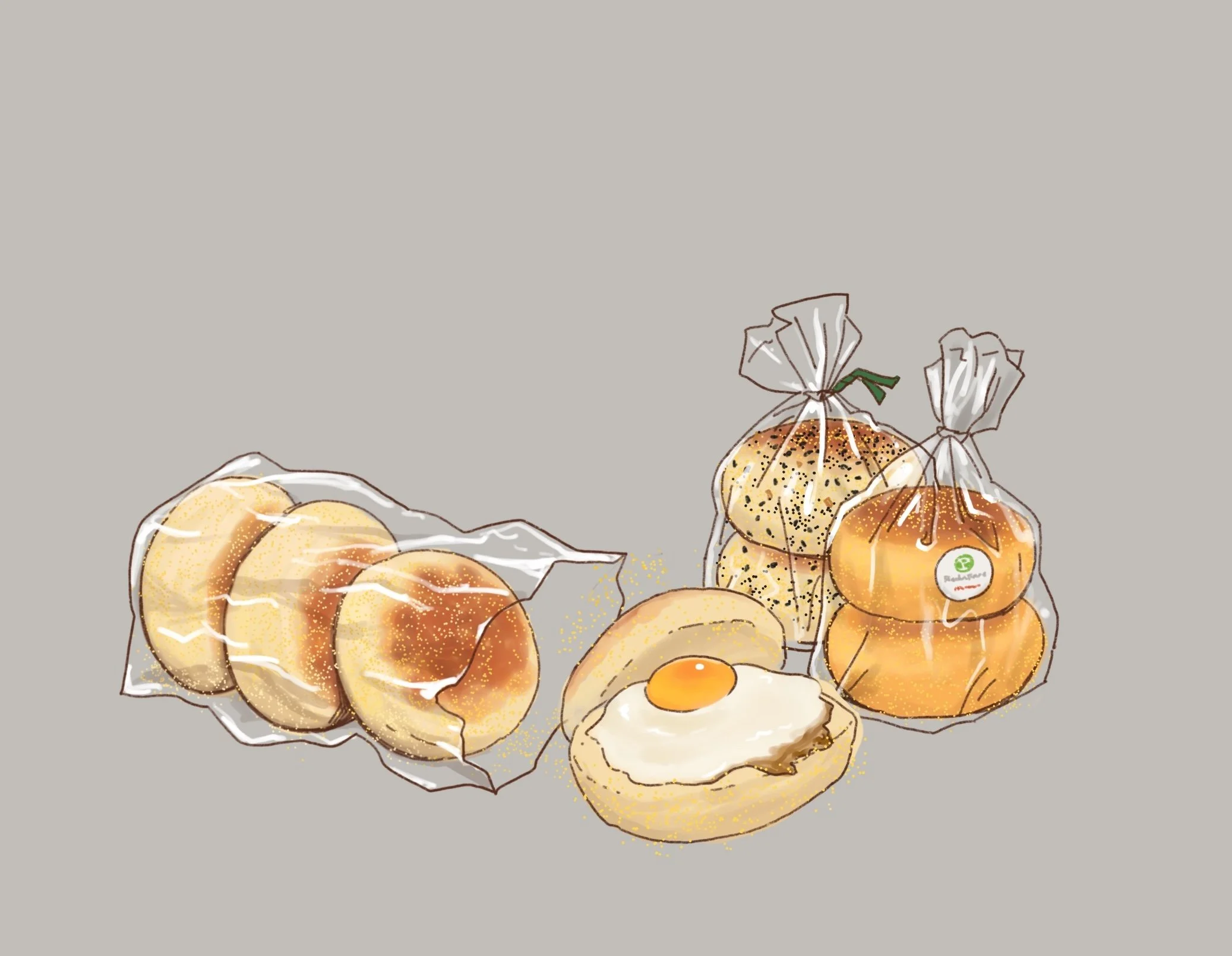
First draft of illustration
The Idea

Cute but basic…
Tasty AND recognizable
Just tasty